

Design Studio
1. Overview
The Design Studio is where you customize the look, content, and behavior of your identity verification and onboarding workflow — without writing code. Every workflow (for example, “User Onboarding”) is made up of a sequence of steps (such as PII Validation, Government ID and Selfie Match, Session Risk, or SMS Link). Design Studio lets you customize both:
- Workflow Level — branding, copy, and behavior that apply across the entire workflow by default.
- Step Level — branding, copy, and behavior for one specific step. Step-level settings can override the workflow-level defaults for that step only, without affecting the rest of the workflow.
You'll find both under the same screen: open your template, go to the Design Studio tab, and use the Building Blocks panel on the left to switch between Workflow and Steps.
Changes are saved as a draft until you click Save, at which point the template moves from “Editing” to “Deployed.” Use Discard to revert unsaved changes.
2. Workflow-Level Customization
Navigate to: Design Studio → Building Blocks → Workflow
These settings apply to every step in the workflow unless a specific step overrides them (see Section 3). The Workflow group contains six building blocks: General, Header, Footer, Form, Form State, and Custom Landing Pages.
2.1 General
Sets the overall theme and language behavior for the entire workflow.
- Multi Language – top-right toggle. Turns on translatable field support across the workflow.
- Favicon – upload a custom browser tab icon.
- Background Style – set a solid Background Color, or choose to Use Background Image instead.
- Style – choose the Font and Font Color used throughout the workflow.
- Custom CSS – optionally enable Custom Global CSS Styles for advanced styling.
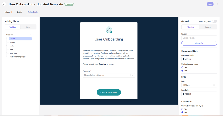
Workflow → General (Theming tab)
2.2 Header
The header is disabled by default. Toggle it on to reveal Theming and Content options for adding a custom header (e.g., logo bar or navigation) above the form.
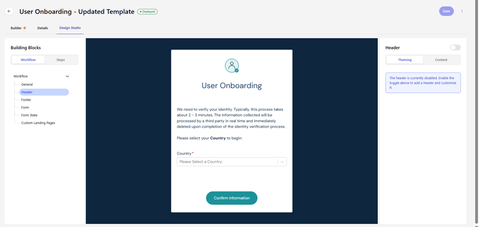
Workflow → Header — disabled state, with the enable toggle at top right
2.3 Footer
Works the same way as the Header: disabled by default, with a toggle to enable and then customize a footer shown below the form (e.g., legal links or copyright text).
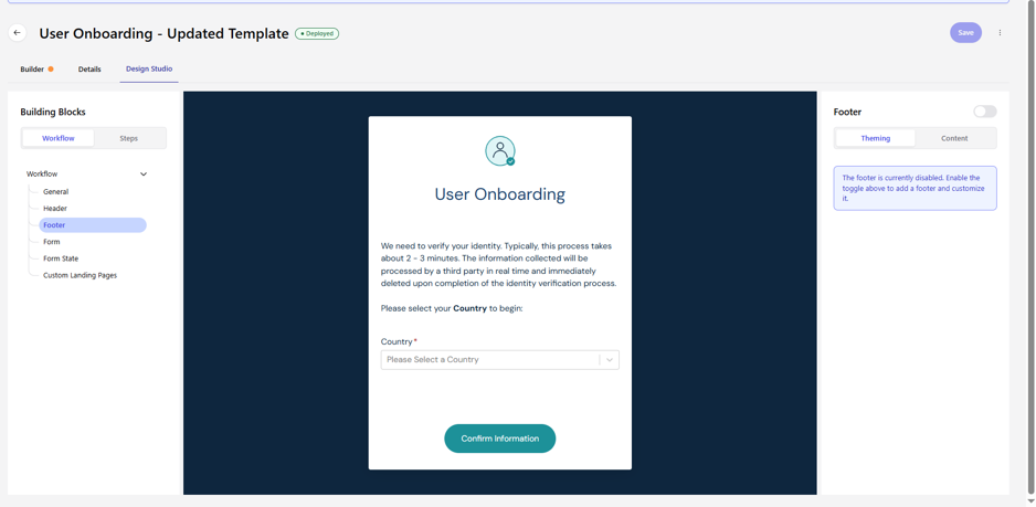
Workflow → Footer — disabled state
2.4 Form
Controls the card that houses the entire onboarding form — its title, logo, background, and the primary action button.
Theming
- Title – Add Title (Yes/No), Position (e.g., center), Text Color.
- Logo – Add Logo (Yes/No), upload file, Position, Width, Height.
- Background – Background Color of the form card.
- Confirm Button – Text Color, Background Color, and Corner Radius (rounded-corner slider).
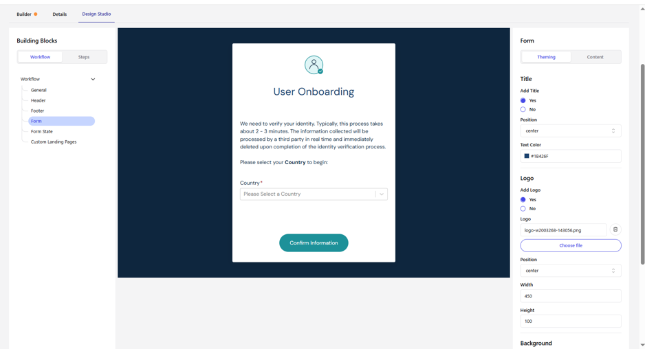
Workflow → Form (Theming) — Title & Logo settings
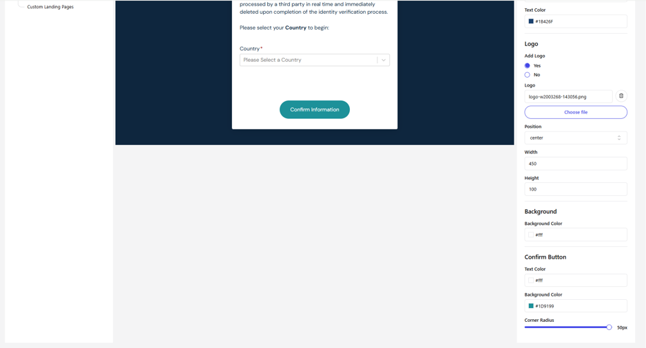
Workflow → Form (Theming, scrolled) — Background & Confirm Button settings
Content
- Title Text – the heading text shown on the form (e.g., “User Onboarding”).
- Logo Alt Text – accessibility text for the logo image.
- Confirm Button Type – the label/type shown on the primary button (e.g., “Confirm Information”).
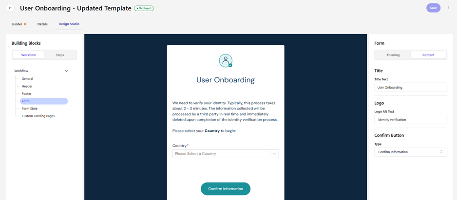
Workflow → Form (Content tab)
2.5 Form State
Controls the interim “Processing” screen shown while a step is being evaluated.
- Show Processing Page – Yes/No.
- Show Loading Indicator – Yes/No, toggles the spinner shown on the processing page.
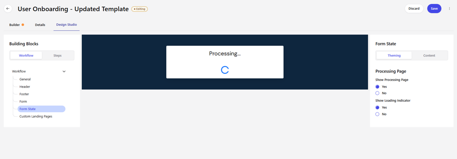
Workflow → Form State — Processing Page settings
2.6 Custom Landing Pages
Controls the final result pages shown once the workflow completes — one for a successful outcome and one for a failed/denied outcome.
- Toggle & Landing Page – enable/disable this feature, and set the Landing Page path (e.g., display/fin).
- Theming – live preview of both the approve and deny landing pages.
- Content – edit the Approve Message HTML and Deny Message HTML shown to the user, and choose whether to Show Transaction ID Label.
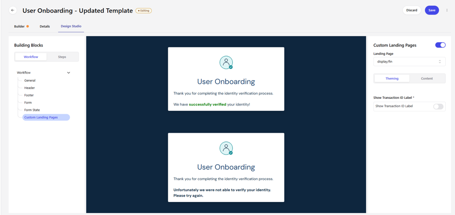
Workflow → Custom Landing Pages (Theming) — approve and deny preview
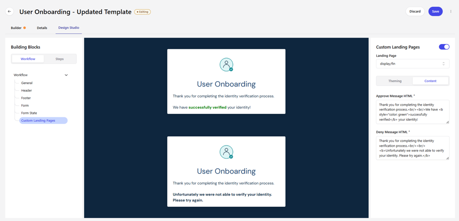
Workflow → Custom Landing Pages (Content) — HTML message editors
3. Step-Level Customization
Navigate to: Design Studio → Building Blocks → Steps → select a step from the dropdown
Every step in your workflow — for example Government ID and Selfie Match, PII Validation, Session Risk, or SMS Link — can be customized individually. Pick the step from the dropdown at the top of the Steps panel; the Building Blocks tree below it updates to show two groups: Override Workflow and Step.
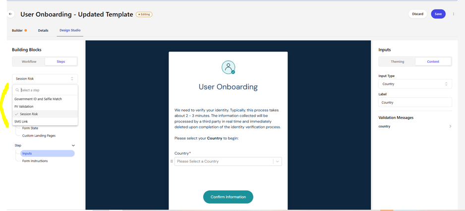
Steps → selecting a step (Government ID and Selfie Match, PII Validation, Session Risk, SMS Link)
3.1 Override Workflow
This group repeats the same six building blocks from the Workflow level — General, Header, Footer, Form, Form State, and Custom Landing Pages — but scoped to just this one step. Use it when a specific step needs different branding or content than the rest of the workflow (for example, a different header for a higher-risk verification step) without changing the global settings.
3.2 Inputs
For steps that collect data on a form (e.g., PII Validation), each field appears as a reorderable item (drag handle) in the Inputs list. Selecting a field opens its settings:
- Input Type – the kind of field (e.g., Country, FullName).
- Label – the display text shown to the user for this field.
- Validation Messages – a list of expandable, per-rule messages you can customize (e.g., for FullName: fullName, fname, lname, suffix).
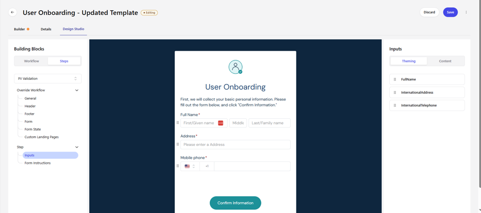
Step → Inputs — reorderable field list (PII Validation)
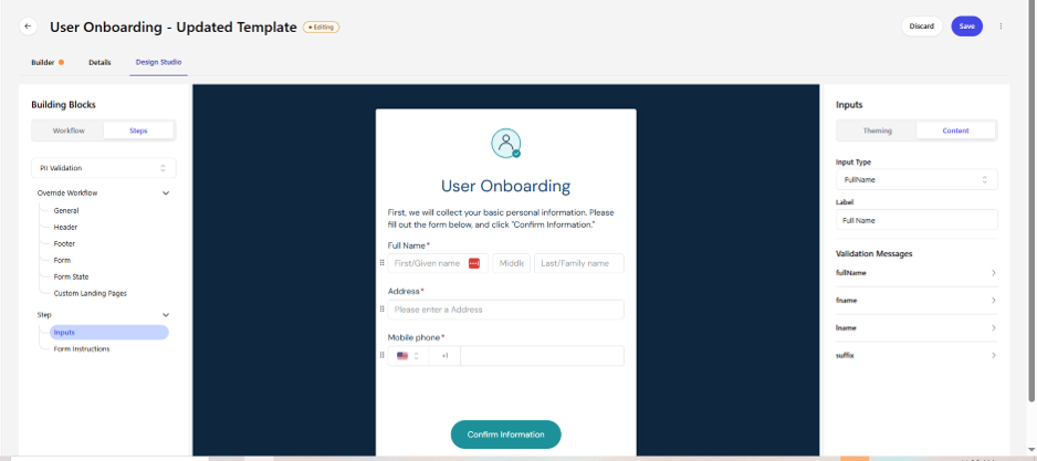
Step → Inputs → Content tab for the FullName field
3.3 Form Instructions
Lets you insert custom copy (with HTML/CSS) at three points around the form:
- Start of Form
- End of Form (Above Submit Button)
- End of Form (Below Submit Button)
Each of the three areas has its own Custom HTML & CSS toggle, an HTML Template box, a CSS Content box, and a Template Fields helper. To support translation, wrap replaceable text in the placeholder syntax shown in the panel: ${{example_field_name}}!"Fallback text"}. A consent checkbox toggle (labeled Explicit Consent or Boku Consent, depending on the step) is also available in this section.
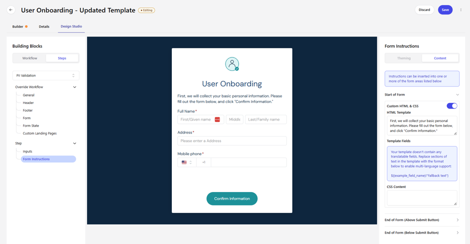
Step → Form Instructions — Start of Form, with Custom HTML & CSS expanded
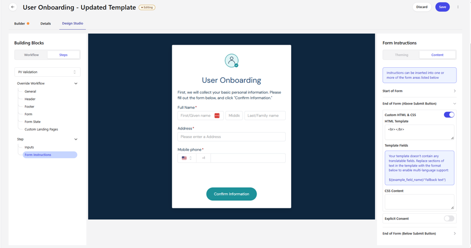
Step → Form Instructions — End of Form (Above Submit Button), with Explicit Consent toggle
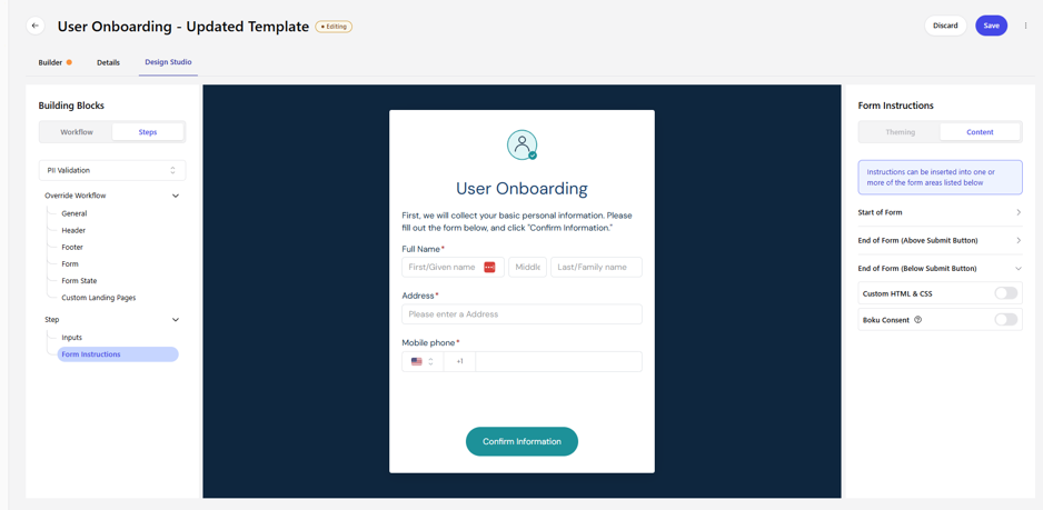
Step → Form Instructions — all three insertion points collapsed, with Boku Consent toggle
3.4 Async Settings
Steps that hand off to a mobile device or a third party for verification (for example, Government ID and Selfie Match) include additional async building blocks: Async General, Async Form, Async Form State, and Async Complete Page. These follow the same Theming/Content pattern as the rest of Design Studio and let you customize what the user sees while verification is happening off-device. The Async Form State screen, for example, lets you select which async status to edit (e.g., “Incode Verification Started”) and set its copy:
- Continue Info Phone Text – the message directing the user to their phone.
- Detail Text – supporting instructions shown beneath it.
- Async Submission In Progress Text – the label shown while the system waits for the mobile step to finish (e.g., “Waiting…”).
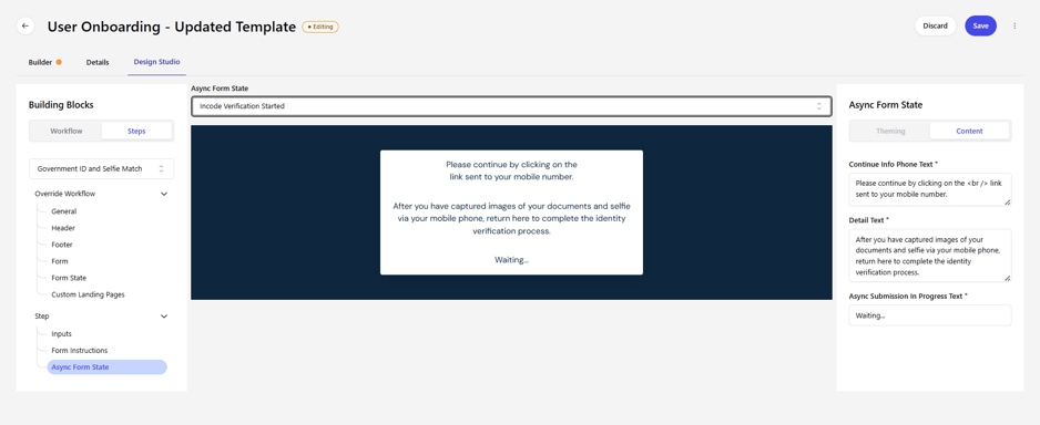
Step → Async Form State (Government ID and Selfie Match)
3.5 Messaging
For steps that send the user an outbound message — such as SMS Link, used to text a verification link to the user's phone — the Messaging block lets you configure the message template:
- Template Type & Template – choose the message use case (e.g., Doc Capture/FastTAP Link SMS) and the specific Template (e.g., SMS Link Template).
- Live Preview – a phone-style mockup shows exactly how the message will appear to the user.
- Template Fields – lists the dynamic placeholders used in the template (e.g., dcuiSMS.clickUrl). Hover an underlined portion of the preview to see which field it maps to, and edit its default text directly.
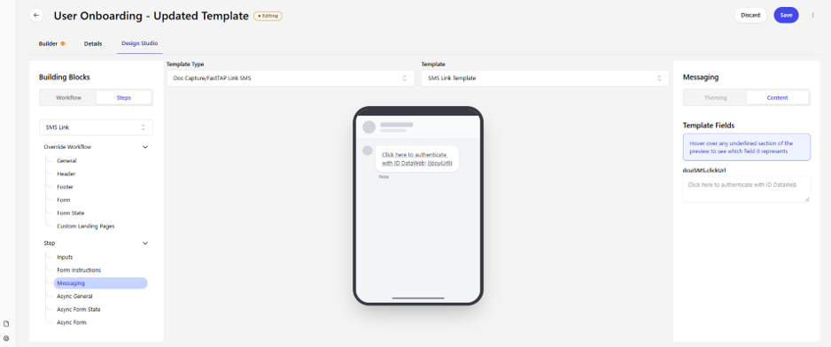
Step → Messaging (SMS Link) — template selection, live preview, and template fields
3.6 Document Capture Interface (Mobile)
For steps that hand off to a mobile device for document capture (e.g., Government ID and Selfie Match), a separate User Interface panel lets you brand the mobile capture screens the user sees on their phone. A live phone preview updates as you make changes:
- Logo and Subtitle – upload a custom Logo (JPEG, PNG, or SVG) and set a Subtitle shown beneath it.
- Button – set the Corner Radius (px) of the primary button, along with its Button Color and Button Color Text (hex values for background and text color).
- CSS – choose Don't Include, or supply your own custom CSS file to further style the mobile screens.
- Hide Footer Branding – checkbox to remove the default footer branding from the mobile capture screens.
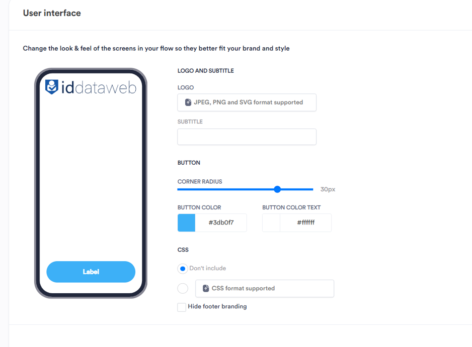
Step → Document Capture → User Interface — mobile capture screen branding
4. Quick Reference
A summary of every customization block covered in this guide:
| Level | Building Block | What You Control |
|---|---|---|
| Workflow | General | Multi-language toggle, favicon, background color/image, font, font color, custom global CSS |
| Workflow | Header | Enable/disable, then theme and content of the workflow header |
| Workflow | Footer | Enable/disable, then theme and content of the workflow footer |
| Workflow | Form | Title, logo, background, and confirm-button styling and copy |
| Workflow | Form State | Show/hide the processing screen and its loading indicator |
| Workflow | Custom Landing Pages | Enable/disable, landing page path, approve/deny messaging, transaction ID label |
| Step | Override Workflow | Re-apply General/Header/Footer/Form/Form State/Custom Landing Pages settings for one step only |
| Step | Inputs | Field type, label, and validation messages for each input on that step's form |
| Step | Form Instructions | Custom HTML/CSS copy at start/end of form, plus consent checkbox toggle |
| Step | Async General / Form / Form State / Complete Page | Copy and behavior shown while an async (mobile/third-party) step is in progress or completing |
| Step | Messaging | Outbound SMS/notification template selection and templated field values |
| Step | Document Capture – User Interface | Mobile capture screen logo, subtitle, button styling, custom CSS, and footer branding |
Updated 25 days ago