AXN Admin allows you to fully customize your verification workflow's user interfaces.
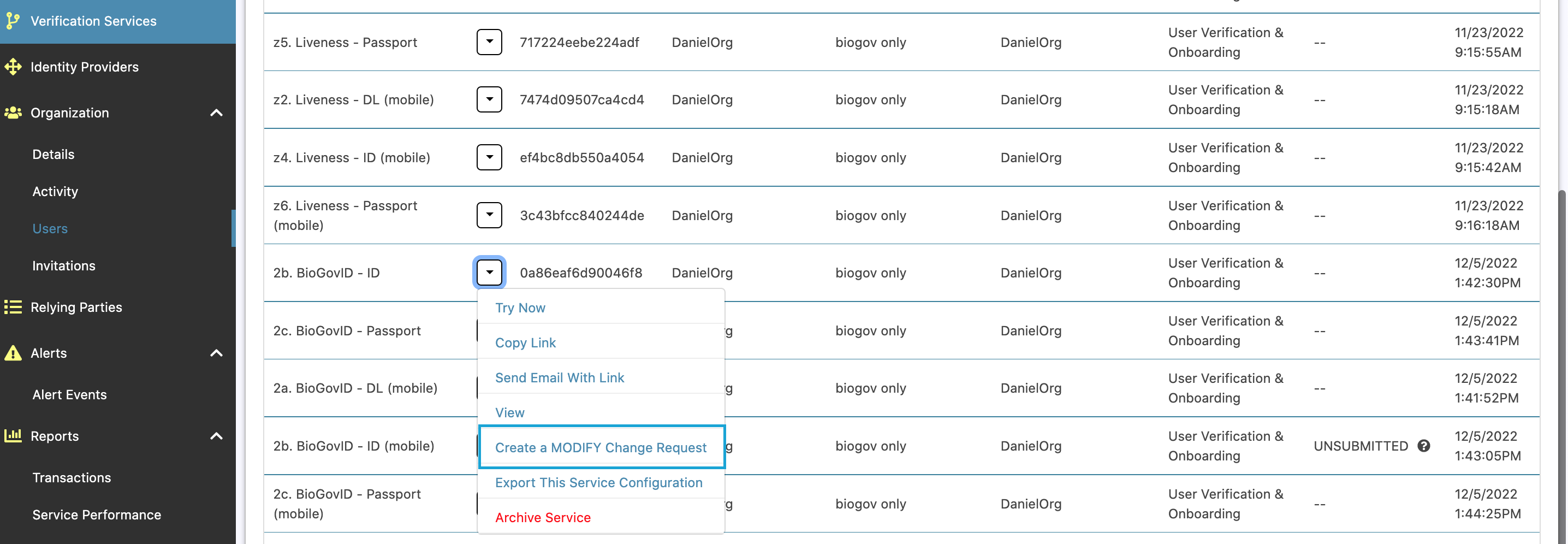
To start, open up a service by clicking the options button, and Create a MODIFY Change Request.

Once open, you can now edit your service.
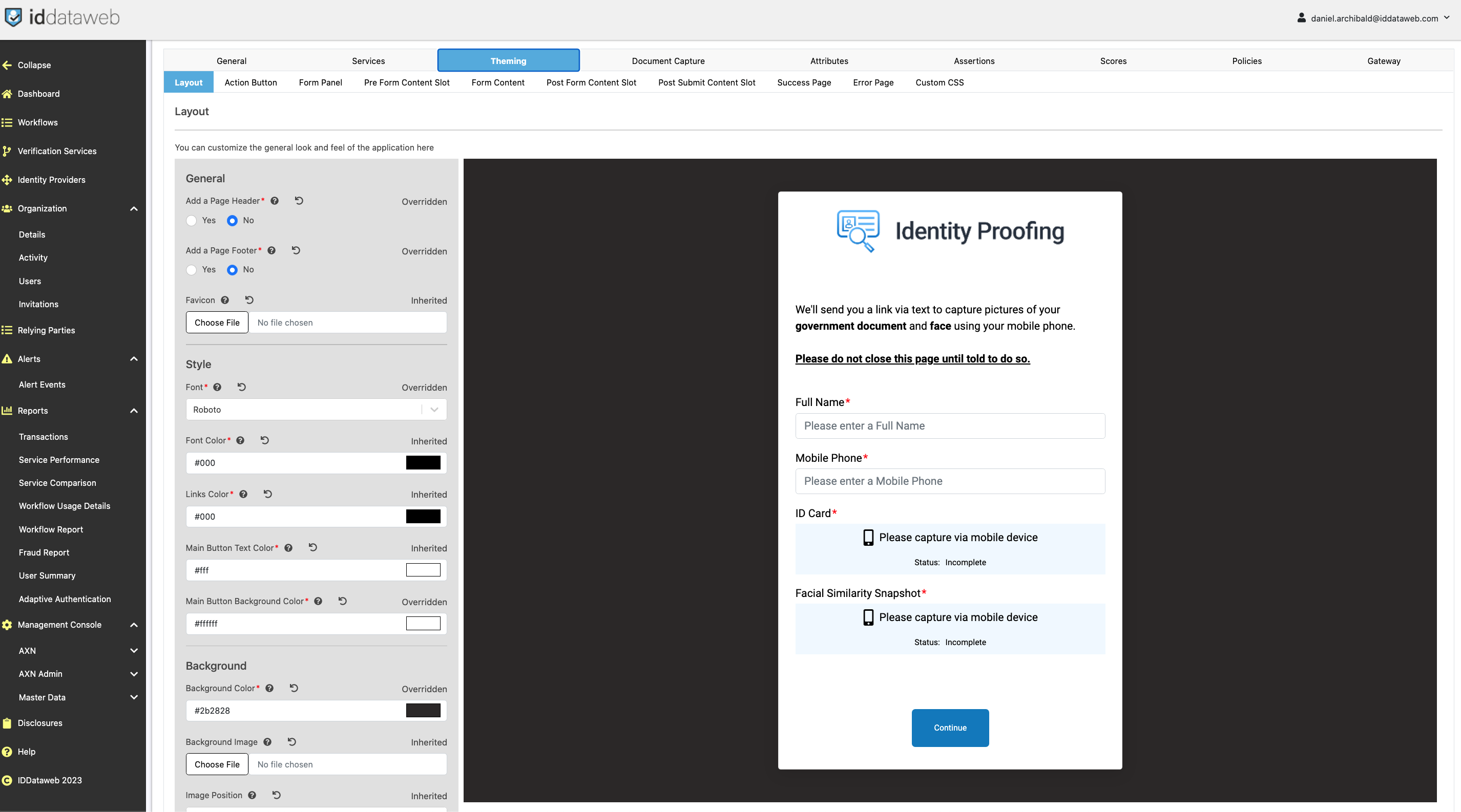
Next, click on the "Theming" tab.

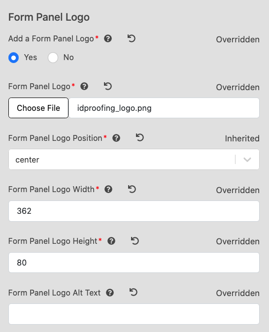
- You can add your Logo to the Form Panel.
- Set "Add a form panel Logo?" to "Yes"
- Upload your logo
- Adjust the size and positioning.

From here, you can manage all UI components.
Tab Name | Description |
|---|
Layout tab | Allows for customization of basic UI.
- General - Add, remove or adjust page headers and footers. Enabling a
header or footer will open new tabs for further configuration.
-Style - Text, button and page styling. Includes font, text color, button color, page background (color and image), and Favicon customization.
|
Action Button tab | Allows for customization of the main "Action" button.
- use custom button text
-
- Selecting "Yes" will allow you to write custom text for the button.
-
- Selecting "No" will allow you to choose from the "Default button text" dropdown.
- Button background color - adjust the background color for the action button.
- Button text color - adjust the text color for the action button.
- Button border radius - adjust curved edges. Higher number - more curve. Soft cap: 40
|
Panel tab | Adjust settings for the main content panel.
- Form panel background color - adjust the background color of the main content tab.
- Add a form panel title?
-
- Yes: Introduces new text box beneath logo at top of page, and allows you to specify text.
-
- Logo file: URL path of the custom logo for this page. To upload, please reach out to your solutions architect.
- Logo position - align the logo on the panel screen.
- Image width & height - change size of logo image.
- Logo alt text - define alternative text for logo image.
- Description text - Description under the "logo" and "title" fields.
|
Content Slot Tabs | Allows for customization of images, text and directions around the user input form. For more details, see the User Form Customization page. |
Success Page | Handles the transition page between transaction completion and redirect.
- Disabled: no transition (recommended)
- Enabled: Show transition
-
- Success page header: Customize "Header" of Success page.
-
- Success Text - customize body text of Success Page.
-
- Show loading Indicator while waiting?
-
-
-
- No: Does not show loading gif.
|
Error page | Allows for customization of user-facing messages when something goes wrong during a verification transaction.
- Default error page header - Define the title of the error page.
- Generic message - "catch all" message for if something goes wrong on the page.
- Invalid session message - Specific message to handle an invalid session, including timeout. Should indicate to restart the process.
- Back or Refresh Error Header - Defines header to handle cases where user presses "back" or "refresh" on the page (not supported.)
- Back or Refresh error message - The body text to handle a "back" or "refresh" error.
|
Custom CSS | Allows you to fully customize the CSS of the page. To obtain the starting files, please ask your solutions architect. |
